NBA 2K18
NBA 2K18 Video - Developer Diary: The Art Behind the Game
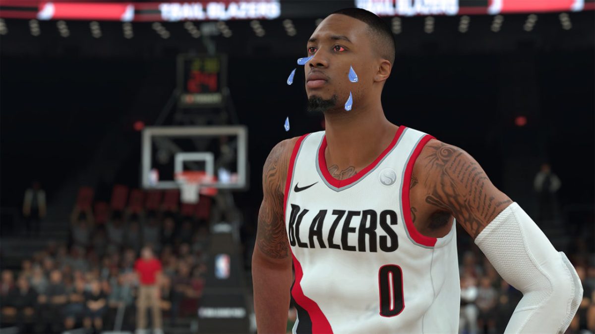
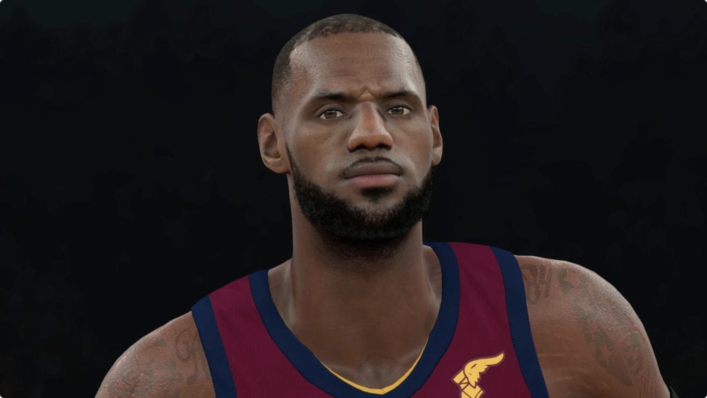
Today 2K released the first trailer for NBA 2K18, revealing major updates to the appearance of uniforms and the players themselves for the most true-to-life visuals yet. The developers utilized brand new processes – including new photo techniques and laser scanning – to ensure even the smallest of details were captured to create a hyper-realistic experience. These upgrades include:
- Photo Techniques: The developers used new photo techniques with the ability to separate colors for more accurate player skin tones that react to light in true-to-life form.
- Uniforms: The team visited the NBA New York offices to laser scan each and every new Nike uniform and over 200 pairs of shoes to capture each detail, down to the stitches.
- MyPLAYER: The customization is like never before, with almost an unlimited amount of body types available and options to adjust and scale nearly every aspect of the athletes in game.
To learn more about how the art came to life and for a first glimpse at gameplay, check out the trailer.
2K also announced today that on September 8, 2017 fans can get a taste of NBA 2K18 early with this year’s version of “The Prelude,” a free downloadable experience that begins your MyCAREER on PlayStation 4 and Xbox One. Players can kick-off their NBA 2K18 experience prior to the game’s launch and continue where they left off when the game officially releases one week later.
NBA 2K18 will be available on September 19, 2017. Fans can pre-order NBA 2K18 at participating North American retail and online vendors, ensuring they receive their copy and in-game bonuses four days early beginning on September 15, 2017.
Apart from that the game looks amazing art wise, at least for current players/teams.
That's an extremely bold statement and i'm hoping they can live up to the hype. So far the graphics look beyond amazing but I wish they had gone more in depth on the Create A Player part besides just a few of the new hairstyles
They even improved some of the guys that already looked good.
Finally captured CP3....I wonder of they finally nailed Wade too..
Sent from my SM-G955U using Operation Sports mobile app
Sent from my iPhone using Tapatalk
Little peak at Marcus Smart
Now my big question regarding the CAP...can we finally make multiple looks for MyPlayer again like the original mode had? I hate being required to use the same face for my 7'0" center as I do for my 5'11" PG. I love creating new characters to play as.
Sent from my HTC Desire 626 using Operation Sports mobile app
Sent from my iPhone using Tapatalk
I don't know if that's the actual create a player system. I think it was the system from a different game judging by how drastically the color scheme and background changed once they moved away from the sculpting section to the hair section.
Sent from my Z981 using Tapatalk
Just hope for 2 things: classic players finally received the long overdue update as well and we can edit generic players on classic teams or add created players :)
Sent from my iPhone using Operation Sports
But aside from all that, I'm absolutely blown away by the level of detail in every visual regard. For the first time ever, I didn't even find myself nitpicking over jersey & court colors lol...and It really don't make no sense how realistic those socks & kicks look. Whatever new scanning technology they upgraded to, is GOAT!!! This is by far the greatest looking sports game of all-time (sorry 2k14 lol)
Either way, looks great. Hopefully the feel of the game matches the visuals.
They even improved some of the guys that already looked good.
Finally captured CP3....I wonder of they finally nailed Wade too..
Sent from my SM-G955U using Operation Sports mobile app
Honestly, that's the EXACT same CP3. The eyes still aren't bright enough, but it's close and they're missing the biggest thing that's thrown him off for years...his damn beard lol. Robin Lopez still also has that weird landing strip beard instead of a full one as well for some reason as he's had a full beard for the last 2 years. LaVine still doesn't have a goatee and looks like a kid. Conley still has a mohawk even though he rocked the fro all last year.
Winslow's hair is still the electric socket fro from 2k16(whatever De'Arron Fox/Josh Jackson hair looks like, Winslow needs to share it). We also know Kawhi still doesn't have a beard from the gameplay impressions day snippet.
Like I said in another thread, some of this is from older builds though so hard to know for sure if they've updated dudes since, for example:
That's the Ben McLemore from 2k17 on the left but the screen we got the other day clearly showed an updated version of him.
Legs look good in that small snippet.
Sent from my SM-G930T using Tapatalk
No. In the last game you could chose present noses and eyes etc just like that but then you could do in depth sculpting in a separate menu.
Anyway... Body types made it in? I'm preordering as soon as I get home.
Sent from my Z981 using Tapatalk
I'm sorry for voicing my opinion. We've known for a good couple weeks that the art has been improved, so nothing new really there. The only thing art wise that I want to know is if they've improved the classic teams. I'm not complaining just stating that it's unlikely we're going to see a MAJOR overhaul with the classic teams (which is what they really need).
We might see improvements, like we've been getting the past few years but the fact that they're not talking about it in the video (which is dedicated to art) just tells me we won't see that huge overhaul that they've been needing the past 4 years.
Sent from my Z981 using Tapatalk
Sent from my SM-N920T using Tapatalk
Gotta say again man, this was an incredible trailer...hope all the art guys are feeling better this year....there have been some real pre release wars over the last couple of years. Dont dissapear now that there is some positive news fellas
Sent from my SM-G955U using Operation Sports mobile app
Sent from my iPhone using Tapatalk
By far.
This is definitely up there with Live 18's version too
Wanna see CP3 body. Westbrook's and Giannis body.
Can't wait man.
LBJ cankles gone makes me optimistic.
Awesome.
Sent from my SM-G930T using Tapatalk
That said, I think the game looks great but I had the same thought in the back of my head regarding classics. I really want to believe 2K at least made a halfsie upgrade to the retro jerseys too but I think classic folks know by now to prepare for the worst. Some of us just recall that when 2K was proud of their classic teams, they'd usually find a shot or two to slip into trailers like this. So when we notice their absence, it's often sends out a bat signal to the classic contingent that the status of their quality improvement remains unknown.
Speaking only regarding the current era stuff though, it obviously looks pretty incredible.
Sent from my SM-G930T using Tapatalk
It should be obvious the sacrificed crowd lighting(otherwise known as global lighting) to increase the player detail. Textures, and sweat have been tweaked and/or enhanced and it makes a world of difference as they're surpassing 2k14. It's one of the reasons Live always has such dark arenas yet they're player model have been more graphically appealing.
Anyway... Body types made it in? I'm preordering as soon as I get home.
One of the backgrounds is blue and the other is red. The fonts are completely different and so are the graphics. I'd be surprised if it wasn't from an older game
Good point. It looks like the 2k14 screen actually.
That's what I was thinking. I wonder why they didn't show off the new system
The career and park are easily their most popular modes. Majority of buyers get this game purely for career. OS is a niche market/fanbase makes sense to cater to the majority.
Perhaps the trailer was composed from an earlier build and they were still playing around with that part? Or they wanted to put it in as a contrast to what they're doing now to show how far it's come.
Naw bro last year it looked like crap graphically from the jump.
BODY TYPES confirmed for 2K18! I'm assuming this will carry over to the general CAP system (hopefully)
Fair enough, but how do you know that? Any real numbers to back that claim up? Every person on my friend list gets the game for franchise/online leagues and for regular quick games with real nba players
This was one of the biggest areas needing improvement, so leading off with this info was huge. Some of those scans are recycled from previous year's (older builds?), but hopefully we'll see updates for Marcus Smart, Justice Winslow and (apparently) Kawhi Leonard (he needs his trimmed beard). Everything else from body types, jersey and shoe details was damn impressive. Props to the 2K art team for taking that long, sometimes neurotic thread from last year - and similar input/criticism like it - to heart.
And with that I've now pre - ordered 2K18. They've improved or adjusted all my main areas of concern from 2K17.
Although, still waiting for further clarification on the CAP system and help defense by the A.I.
from Bills Backer/Spurs Nation HQ
No, that's not a fact.
Sent from my iPhone using Operation Sports
You just answered your own question. You said everyone on YOUR friend list. The vast majority of people who buy 2k are casual players which means online(mypark/myteam) and mycareer stuff
In the nicest way possible how many people are on your friends list? Would you add someone to your friends list if they exclusively play MyCareer?
It's the same way social circles work. We connect with people similar to ourselves and form our own little bubble which can skew our perspective on things (sort of like how people never thought Trump would get elected because they weren't aware of the "other half" - "nobody I know will vote for him"). It's a very small sample size (your friends list) compared to the 10 million or so people that buy it.
2k have stated before it's their most popular mode. On top of that the majority of people playing 2k are children under the age of 18/19 and they tend to lean towards playing modes like career in general.
Sent from my iPhone using Operation Sports
They limited you to one unfortunately.
I honestly just want them to make sure every one is on the roster that was on it because the info is so easily available. Anyone not alive probably requires family consent so that's probably why some rosters have so many generics and some players may not want to be in the game or simply never respond to the messages or can't be found. I feel that must be the case for Sasha Pavlovic a guy who STARTED for the Cavs in their finals run and hasn't been on a 2k game in forever
Sent from my iPhone using Operation Sports
True.
But ugly looks don't (refer 2K17) 😂
2K is officially trolling with this video man. How are you going to just show The Greek's head and not the rest of him? lol. No Westbrook either? Shame on you 2K! Leave the trolling to us posters:tongue:
And for those that don't know how older builds work, here's an example so try not to be so negative off the bat:
We might see improvements, like we've been getting the past few years but the fact that they're not talking about it in the video (which is dedicated to art) just tells me we won't see that huge overhaul that they've been needing the past 4 years.
I would think classic teams would get their own video.
Yep. I think I'm fine with it too considering how much better the game and player builds look this year. I'm seriously thinking about buying a 4K set to enjoy this thing. Naturally, I want it all but I understand that that's just not realistic. The game has been like 50gb the last few years, theres only so much space. IF these MP CAP changes apply to all our created players it'd be well worth the loss with lightening, IMO.
I would think classic teams would get their own video.
One can only hope, and if we do I will stand corrected.
Seems like we won't have any greyish white looking accessories.
Like someone mentioned, I would love to be able to adjust how jerseys fit on certain players.
Speaking of jerseys, I think it would be nice as hell if jerseys became untucked. Untucked jersey Kyrie is like a super hero lol.
Sent from my iPhone using Tapatalk
Sent from my Illudium Q-36 Space Modulator,
But ugly looks don't (refer 2K17) 😂
Good looking game is a longevity factor for me...because theres always something to appreciate ..its partly why I'm currently playing 2K16 instead of putting Weight Watchers Gordon Hayward on thr C's and playing with updated 2K17 rosters, lol
Necks, CP3 looking decent...what you gonna do with yourself Teddy....
Where? I didn't see it. That's the same CP3 from 2k16 and 2k17
lol, that tells you how long i last played '17. as long as they got his body right, i'm good.
Sent from my iPhone using Tapatalk
Somebody please do a side by side with 17 lebron. He looks incredible This year. Perfect
I was going to mention this...I dont think there needs to be any fear they will differ tbh
and maybe that beard really does make a difference on CP3...lol
If you don't like it, then don't play it...it's that simple
and tell me that isn't 100% Kyrie
I second this. Side by side with that pic and another one recreating the dunk from the video, so we can compare his 2k17 bodytype and most importantly, see the difference in the tree trunk calves and ankles.
I'm sure that this new system is going to give us the ability to come up with really accurate faces (far better than what we had in years past)
Just gonna take some getting used to.
I'm excited to have the game available to me while on the train since I barely have time to game at home at the moment. But, if it's a watered down version of the game, I'll pass. I understand it won't be as amazing as the PS4 and XBOX versions, but it should still include these art details.
I'm sure that this new system is going to give us the ability to come up with really accurate faces (far better than what we had in years past)
Just gonna take some getting used to.
i think the three or four face that the are showing us are preset face and they are adjusting it
Sent from my iPhone using Operation Sports
Definitely him
This honestly just lowered my concerns. It can't be too different. Only thing I really expect them to not carryover, are tattoos
You could be right fam
They even improved some of the guys that already looked good.
Finally captured CP3....I wonder of they finally nailed Wade too..
Sent from my SM-G955U using Operation Sports mobile app
I've been waiting on CP3 to be redone, and looks like they got him right.
Show me something natural I wanna see some stretch marks
I'm sure that this new system is going to give us the ability to come up with really accurate faces (far better than what we had in years past)
Just gonna take some getting used to.
This^. Dot placement had to be impeccable for a decent looking CAP, which alone was a hard task to complete
Good to hear that the CAPs have been an area of focus. But from what i can tell by the visuals seen in the video it looks much of the same though: artificial looking faces. They look plastic and generic. But will wait and see how it looks when i actually play the game. Hopefully roster/draft class makers can still make players look unique via tats, body size, accessories, etc.
Looks like body size is tied to the weight number though, which i guess isn't too bad... it's better than no bodytype customisability at all.
Need to see how it all looks in 5-on-5 gameplay before making any conclusions
I don't mind the 1-30 system that generates different features. That's how FIFA do it and it looks fantastic. I don't think that's the reason why CAP still looks mediocre in 2k18
Great job with the artwork, 2K! I'm also salivating over what I've read about the gameplay improvements.
I'm guessing all of those combos create realistic looking CAP in almost every combo
Nah, that's just an older build, which I highlighted earlier in the thread. The cyberface being the giveaway.
Probably not on real players.
You should definitely be commended for the work you guys put in because it shows.
Scanning accessories finally as well....Love it man
That face comparison is ridiculous sheesh.
Sent from my SM-G935V using Tapatalk
I can't wait to hop on MyPlayer. With all these improvements plus the fact that 2K has finally gotten the Knicks colors correct, I can't wait to see what my MyPlayer looks like in that Knicks jersey.
Sent from my SM-G935V using Tapatalk
Ok.......I don't want any wrong colour tones or neck/armpit trim etc etc etc.....
I want every teams jersey, EVERY TEAMS jersey to be perfect. It's time.....
Ok.......I don't want any wrong colour tones or neck/armpit trim etc etc etc.....
I want every teams jersey, EVERY TEAMS jersey to be perfect. It's time.....
So far they're looking pretty spot on. Haven't noticed any issues thus far
Sent from my SM-N920T using Tapatalk
INACCURACIES:
#1 - They've got the Cavs jersey colours wrong, for whatever reason 2K have always had a problem when it comes to getting red/orange colours correct. This can easily be fixed. The likelihood is won't be fixed considering these mistakes have been ignored in the past.
#2 - The Mavericks icon accessories are incorrect. They should be the same colour as the dark navy, instead they're a light navy/blue:
#3 - DeMarcus Cousins headband clips through his ear, it's also the wrong colour. It should be the same colour as the jersey but instead it's a lighter blue:
#4 - The Pelicans association shorts have a wrong shade of blue and should be the same shade as the jersey above. As you can see jersey blue is darker, the shorts blue is lighter:
NEEDED UPDATES:
#1 - Mike Conley hasn't had this haircut in three years. He needs an nappy afro, I think a new face scan is needed here:
#2- Lowry is still wearing an arm pad, he hasn't worn this since the end of the 2015/2016 Season. You can also see Norman Powell's new face here:
#3 - Chris Paul has had the same face since NBA 2K15. He has since got a different haircut, he's also grown out a beard:
#4- Marcus Smart no longer has this mohawk/Odell Beckham Jr hair:
via GIPHY
I just watched it on my oled I wish August would past lol wish it would activate HDR
Hey every bit of criticism makes the game better, I'm not complaining. If I was I would make a full on hate post about it. I feel like these criticisms are valid and could be fixed very easily.
old Curry
new Curry
You sir , have an amazing eye I'll give you that.
His shoulders and traps looked more accurate in 2k17 but everything else looks better in 2k18. Really hoping he still has his custom "I Promise" rubber bands as well. I don't see them in this screenshot. His tattoos look a little more faded then they should maybe, but in terms of facial likeness it's basically perfect. Maybe they can adjust the couple things that are off but for the most part besides that, probably the most accurate LeBron player model ever.
INACCURACIES:
#1 - They've got the Cavs jersey colours wrong, for whatever reason 2K have always had a problem when it comes to getting red/orange colours correct. This can easily be fixed. The likelihood is won't be fixed considering these mistakes have been ignored in the past.
Does the Cavs jersey have a Black trim or is that just a dark blue? Hard to tell.
With some of those inaccuracies I think it's inevitable. Colors will never be 100% perfect especially when lighting is taken into account.
Dark navy.
With some of those inaccuracies I think it's inevitable. Colors will never be 100% perfect especially when lighting is taken into account.
It's weird because as I review this it looks like I might be wrong. Some photos show the more red/dark navy approach while others show a pinker wine colour/lighter navy:
Didn't they say they laser scanned the jerseys? How much accurate can you get than that? LOL
Why should he be ? He's just pointing out inaccuracies. Good eye imo.
Shows you the nature of lighting and how much it can change one's perception of colour.
I don't know why you were referencing a close up photo of a jersey in the first place. Lighting affects colour depending on the distances and other variables. All that matters is that in 5-on-5 gameplay it looks the same as it does in the real life broadcast. I.e. from distance.
Colours are colours man, it can still be adjusted so it has a good balance across all lightings.
Nonetheless, the jersey is actually inaccurate as the Cleveland font is too low. It should be higher and closer to the goodyear/nike swoosh logos. Again that can be easily fixed, except we don't know how far the team are into development and if they've finished jerseys yet.
Sent from my Nexus 5X using Tapatalk
Same goes for Allen Crabbe. His current look here: http://www.gettyimages.com/detail/news-photo/allen-crabbe-of-the-portland-trail-blazers-drives-to-the-news-photo/670455806
Sent from my Nexus 5X using Tapatalk
I apologise for trying to help make the game better :waytogo:
and tell me that isn't 100% Kyrie
So I haven't scrolled through the entire thread but if you look closely at Lavine (I'm assuming) socks in the first photo that's a new style of wear for socks in 2K. Something small I know. This game is already the best looking 2K ever.
:lol: It's hilarious how nit-picky some people are. I feel bad for you if minor inaccuracies really ruin your enjoyment of the game that much.
I'm usually quite hard to impress myself, but 2k's progress on the art is a legit triumph this year. It should be very easy for people to forgive minor inaccuracies this year. The game looks great. I'm actually laughing at this
With some of those inaccuracies I think it's inevitable. Colors will never be 100% perfect especially when lighting is taken into account.
Dark blue; Jerseys look accurate. You are correct about the lighting.
I'm usually quite hard to impress myself, but 2k's progress on the art is a legit triumph this year. It should be very easy for people to forgive minor inaccuracies this year. The game looks great. I'm actually laughing at this
No need to feel bad my friend, I don't know why you would when I don't know you. I'm just very passionate about basketball when it comes to accuracy, unlike you. I agree that this game is a huge improvement and I'm glad 2K are finally focusing on this detail. I'm just pointing out some things that can be fixed very easily, especially with things like accessory colours (these things can come through roster updates).
ITS. NOT. EVEN. REMOTELY. CLOSE! :jpshakehe
Sent from my SM-G386W using Operation Sports mobile app
The first being.. Is this color accuracy, level of detail in player models, and detail in the jerseys (fit, materials etc) going to transfer over to Classic Teams? Because those details and colors looked spot on accurate on those current Bulls jerseys and shorts. Would be great if that same care was put into the details (color, fit, cloth physics) of those 90s Bulls teams. Would also be great to see the 2007 Cavaliers uniform colors finally be accurate the Whine and especially the Navy on the alrernate away jerseys has always been closer to blue than the actual darker navy jerseys were in real life.
Which brings me to my second question/concern...Since the old jerseys for teams were not Nike licensed official jerseys but rather Adidas official jerseys are we losing those jersey options entirely? For example are we limited to only the Nike official jerseys for current teams? Or are we able to, for example play with the same number of jersey options we had in 2k17? If so, are those jersey colors re- lazer-scanned so as not to be an eyesore in comparison to the Nike official jerseys? Would hate to lose the Black sleeved Cavaliers jerseys that the team won it's first ever championship in, if that is the case. Also, if that ends up being true will be able to recreate those jerseys with the same level of detail and accuracy in create a team/rebranding to fix these issues?
Don't worry, it's just that time of the year when you can't criticize the game. In 3 months people will be all over how awful the game is. Good eye bro.
You should definitely be commended for the work you guys put in because it shows.
Scanning accessories finally as well....Love it man
Dope side note Joel is a hoop head. LOVES NBA basketball and is super passionate about accuracy!
I'm sure that this new system is going to give us the ability to come up with really accurate faces (far better than what we had in years past)
Just gonna take some getting used to.
I like the number system. Much easier to recreate faces across modes if necessary and to share if someone wants to recreate your CAP. I guess we'll see how detailed it is in the Prelude.
Nonetheless, the jersey is actually inaccurate as the Cleveland font is too low. It should be higher and closer to the goodyear/nike swoosh logos. Again that can be easily fixed, except we don't know how far the team are into development and if they've finished jerseys yet.
I dislike when this assumption is made. How would you know what is an easy fix unless you've worked with the same assets and tools that the 2k art team uses? I would think if such things were easy fixes, which I've heard plenty of times in the past, they would be fixed quick.
Thanks man, I know these inaccuracies aren't huge and can be ignored but every little accurate detail makes the game better in some shape or form.
The first being.. Is this color accuracy, level of detail in player models, and detail in the jerseys (fit, materials etc) going to transfer over to Classic Teams? Because those details and colors looked spot on accurate on those current Bulls jerseys and shorts. Would be great if that same care was put into the details (color, fit, cloth physics) of those 90s Bulls teams. Would also be great to see the 2007 Cavaliers uniform colors finally be accurate the Whine and especially the Navy on the alrernate away jerseys has always been closer to blue than the actual darker navy jerseys were in real life.
Which brings me to my second question/concern...Since the old jerseys for teams were not Nike licensed official jerseys but rather Adidas official jerseys are we losing those jersey options entirely? For example are we limited to only the Nike official jerseys for current teams? Or are we able to, for example play with the same number of jersey options we had in 2k17? If so, are those jersey colors re- lazer-scanned so as not to be an eyesore in comparison to the Nike official jerseys? Would hate to lose the Black sleeved Cavaliers jerseys that the team won it's first ever championship in, if that is the case. Also, if that ends up being true will be able to recreate those jerseys with the same level of detail and accuracy in create a team/rebranding to fix these issues?
These are some great questions and concerns I guess this is the gift and curse of scans once u scan one asset of the game you MUST scan everything to keep it from standing out like a sore thumb.
Once shoes were scanned I couldn't go back to unscanned shoes, I assume I will be the sameway for unscanned jerseys which would suck in this situation of throwbacks/classic teams. Still no word so I'm just assuming but hoping for the best at this point.
As long as you don't post it over and over in every thread and do it respectfully and constructively like you did you're good. I don't have such an eye for details myself.
Sent from my SM-G930T using Tapatalk
Well I actually currently play on the PC version of the game and have for years, and I'm quite well known modder on the NLSC forums. I don't have experience with the tools 2K use but us modders have found alternative such as using GIMP (a free image editing software) or blender (a free 3D model editor).
I am aware at what it takes to update these things, and I have done so in the past. However the art team may have already finished working on the jerseys and have moved onto something else so these criticisms might be ignored.
Nonetheless, the jersey is actually inaccurate as the Cleveland font is too low. It should be higher and closer to the goodyear/nike swoosh logos. Again that can be easily fixed, except we don't know how far the team are into development and if they've finished jerseys yet.
Please let Demarcus Cousins know that his headband color doesnt match his uniform color. A clear inaccuracy on his part!
1. Please tell me the freedom of customization in MyPlayer will be what we see in the CAP suite. If not, the draft classes and any user added players will somewhat ruin the immersion while playing MyGM/MyLeague.
2. I recently bought NBA 2K8 for my son's 360 for the sole purpose of playing the dunk comp. The control scheme was perfect and with some fine tuning across the board, this mode could bring some freshness to the boring ASW. As a standalone mode, this would be another reason to purchase 2K basketball.
Otherwise, everything so far sounds and looks amazing.
Only thing that stood out to me is Cavs maroon color. Should be more red less purple. But maybe they look different in person. They've had that color issue in the past. Everything else looks great. And I'm a stickler for these things.
Sixerss numbers might be a little too high, and too close to font.
Sent from my SM-G955U using Operation Sports mobile app
Edit: looks like u did manage one compliment in ur first post. Along with another complaint about classic teams. So there's that. Again, enough, not worth the time or space in this thread.
Sent from my Nexus 5X using Tapatalk
No joke. Whoever designed real-life Cousins needs to go back to art school.
Kyle Lowry also didn't have enough lines in his lips for a true accurate representation. Disappoint.
True enough though, the "Cavaliers" is too low from the logo's. But DAMN does this game look absolutely amazing.
"I need 5-on-5 I don't care about graphics" get over yourselves.
They even improved some of the guys that already looked good.
Finally captured CP3....I wonder of they finally nailed Wade too..
Sent from my SM-G955U using Operation Sports mobile app
I was thinking the same about Wade. In some earlier impressions, from Forbes I believe, I've read that they've made players like D-Wade and D-Rose (both are athletic guards) too skinny. In this video you can see neither Wade nor Rose. What's more concerning for me is, while displaying bulls new unis, 2k choose to show us LaVine instead of Wade and his face does not look like it was re-scanned. I hope they've made some progress with Wade or at least didn't make it worse. :duck:
Edit: looks like u did manage one compliment in ur first post. Along with another complaint about classic teams. So there's that. Again, enough, not worth the time or space in this thread.
Sent from my Nexus 5X using Tapatalk
Well I think it goes without saying that 2K have been releasing screenshots of the game and it has been clear that the game has improved extremely in the artwork department. I have been giving them a lot of compliments in previous posts, however I will agree with you that my post was probably a bit too direct and I should have started out with something positive. It's just everyone has been flocking this thread with so many positive comments already. I didn't think it was essential.
I appreciate the sarcasm with the mardi gras uniform :lol:
But in this case they do need to update the headband colour for the icon jersey atleast.
Overall great start!
Sent from my iPhone using Operation Sports
Sent from my SM-G955U using Operation Sports mobile app
Use those edit power son son!
In the words of Da_Czar
Faaaaannntastic!
Except that you were the first one to post in this thread, and it was a negative comment :lol:
I'm talking about my second post friend. I already know that this game has been improved in the artwork department and I have already given 2K a lot of compliments in the past whether it was on reddit/OS/NLSC. I do like to voice my opinion and my concerns, I'm sorry I don't give 2K a yes man approach like yourself. I will do better in the future sir :waytogo:
But in this case they do need to update the headband colour for the icon jersey atleast.
That's still not really an accurate portrayal of the color his head band should be considering that one in the picture and most pictures you're going to find of him are drenched in sweat which makes it a darker color than it would be dry and in different lightning.
Beyond that I don't know how you can really comment on which accessory colors are wrong at this point because we don't know what accessories teams are going to be wearing with these new uniforms now since they haven't played a single game in them yet. Have the Pelicans even revealed their Nike uniforms yet? Let's at least see what colors teams will be wearing before we start going into detail about what gear is wrong. Weren't the Pels wearing white headbands with those very jerseys at one point last year?
Sent from my iPhone using Operation Sports
I am aware at what it takes to update these things, and I have done so in the past. However the art team may have already finished working on the jerseys and have moved onto something else so these criticisms might be ignored.
I gotcha man. Had a feeling you were a modder and I mean no disrespect to your talents and credentials. Im just airing on the side of we don't know what goes on in the 2k office (programs and software they work with, deadlines and time management, etc) so it's unfair to assume mistake they make are easily fixable. Who knows though you could be right.
On the lines of that topic though I would like to see more art fixes and patches throughout the season when necessary, whether it's hairstyles, facial hair, jersey colors, court inaccuracies, etc. I'd love if certain players could have multiple options for hair and facial hair based on past styles. Curry, for example, sometimes grows his hair out a bit more like a blow out other times it's a short fade. Another example from the past is where Ben Wallace would have a fro and cornrolls (I'm pretty sure this was in 2k at one point).
Beyond that I don't know how you can really comment on which accessory colors are wrong at this point because we don't know what accessories teams are going to be wearing with these new uniforms now since they haven't played a single game in them yet. Have the Pelicans even revealed their Nike uniforms yet? Let's at least see what colors teams will be wearing before we start going into detail about what gear is wrong. Weren't the Pels wearing white headbands with those very jerseys at one point last year?
Sent from my iPhone using Operation Sports
That is true, accessory colours obviously aren't a major flaw currently as they will change. From the looks of things the Pelicans and Mavericks haven't changed their jerseys so I am basing the accessory colours as of last year. But even then the accessory colours are incorrect based off of last year. I guess what I really should be saying is it looks like the accessory colours are based off of last years colour template (incorrect colours), but now that the art team has got a proper colour template from Nike they can update those accessory colours in the roster (which is where that data is stored).
One that's important to realize is players have a say on what hairstyle they have in the game. Russell Westbrook asked to have his Mohawk in 2k17 even though he didn't have it in real life.
Now sing it with me "Started from the bottom now we're here...."
I'm hoping we can edit players hairstyles (couldn't in 2K16) on our games.
Like Smart's hair and Curry has his playoff look, but usually has his hair shorter than in that video. Or is someone cuts or grows an afro, we should be able to edit it on our game/myleague.
Also, I know the Cavs color is off, but I really don't care for their jerseys normally since they switched after the 2009-2010 season, but I actually like the dark Red look in the video.
I'm creating a point guard with the build of a deron Williams. Not going big baby big though lol
Now sing it with me "Started from the bottom now we're here...."
This should be the post to show how picky everyone is. HUGE thumbs up.
Either way, looks great. Hopefully the feel of the game matches the visuals.
(A) Uniform jersey physics are appropriately back, and I'm loving it!
Regarding uniform. I'm glad real uniform physics is actually back and is looking great for for NBA2k18, and should stay forever. Even uniform that are supposedly skin tight do have movement. A player may wear it skin tight, but there's still motion to them.
Melo and Curry do wear their jerseys tighter, but upon visual inspection, their jerseys are free flowing with physics so to speak.
2016-2017 Melo
2016-2017 Curry
(B) Lighting play a factor in color replication
I think you've (and a couple individuals) have already discussed about the lighting causing color discrepancies. According to only this photo alone, the colors for the cavaliers look to be appropriate.
Now sing it with me "Started from the bottom now we're here...."
Yea. These young bloods don't appreciate the game and how far we've come.
You do know that every 2k from 2k15-17 had this feature? And that's what I used to customize my my player. Either way, I'm positive you'll be able to create a unique player, you're overreacting
Winslow's hair is still the electric socket fro from 2k16(whatever De'Arron Fox/Josh Jackson hair looks like, Winslow needs to share it). We also know Kawhi still doesn't have a beard from the gameplay impressions day snippet.
Like I said in another thread, some of this is from older builds though so hard to know for sure if they've updated dudes since, for example:
That's the Ben McLemore from 2k17 on the left but the screen we got the other day clearly showed an updated version of him.
Good eyes, I noticed because of the beard. I don't think their done scanning everyone in, Ronnie said they would fix Conley's hair.
Regarding uniform. I'm glad real uniform physics is actually back and is looking great for for NBA2k18, and should stay forever. Even uniform that are supposedly skin tight do have movement. A player may wear it skin tight, but there's still motion to them.
Melo and Curry do wear their jerseys tighter, but upon visual inspection, their jerseys are free flowing with physics so to speak.
2016-2017 Melo
2016-2017 Curry
Oh absolutely. I was more referring to the amount hanging over the waistband than anything else. It's not a huge deal, and it looks considerably better already this year. But it would be nice to see more variety in uniform fit between players. Of course, I also don't know how much work would need to go into that, and what kind of resources it would take.
Yes lmaooo