
Most people who play Hockey Ultimate Team in NHL 22 will always be thinking about how to best improve their lineup and become as formidable as possible, but there are some other considerations that should also be regarded as a top priority. Since it’s hard to play well if you’re not looking your best on the ice, it’s worth spending some time browsing through the mode’s many uniforms to find some that speak to you.
Chances are you’re already familiar with all of the uniforms from the NHL, and perhaps you even have some awareness of what the NHL’s minor leagues (AHL, OHL, QMJHL) have to offer from a fashion standpoint. However, you’ll want to expand your horizons even further to see if there are jerseys from international leagues that might match your own personal sense of style.
Obviously, there’s no accounting for taste and everyone is going to want to don something different when they hit the ice. That said, let’s have a look at some of the better, flashier, and just plain weird options you’ll be able to choose from when deciding how you would like to express yourself from a sartorial perspective. It’s possible that one of these uniforms will tickle your fancy, but if that’s not the case, don’t fret. There are plenty of other choices that you can peruse within the mode when deciding how you’d like to present yourself to the rest of the world.
KELOWNA ROCKETS
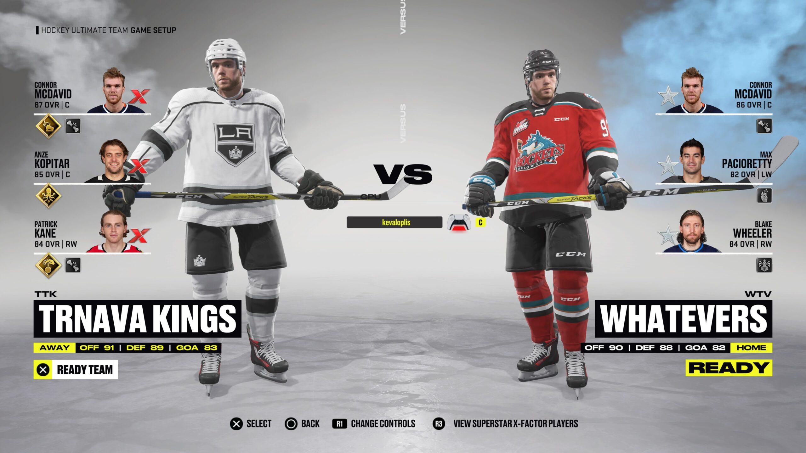
Let’s get the obvious question out the way first. If they’re called the Kelowna Rockets, then why does their logo feature some kind of dragon instead of, you know, a rocket? Setting that aside, the dragon is probably a better option than a rocket anyway, with the scary expression on its face and the way it’s brandishing a hockey stick as if it knows how to use it.
The aqua-blue color of the dragon is then smartly echoed as part of the stripes situated on the sleeves, waist, and stockings. If this one doesn’t have enough dragon for you, the team also has a nifty alternate jersey that features only the twisted face of the beast. It’s enough to make you wonder why the team doesn’t just bite the bullet and change its name to the Dragons considering how much they seem to already be leaning in that direction.
BAIE-COMEAU DRAKKAR
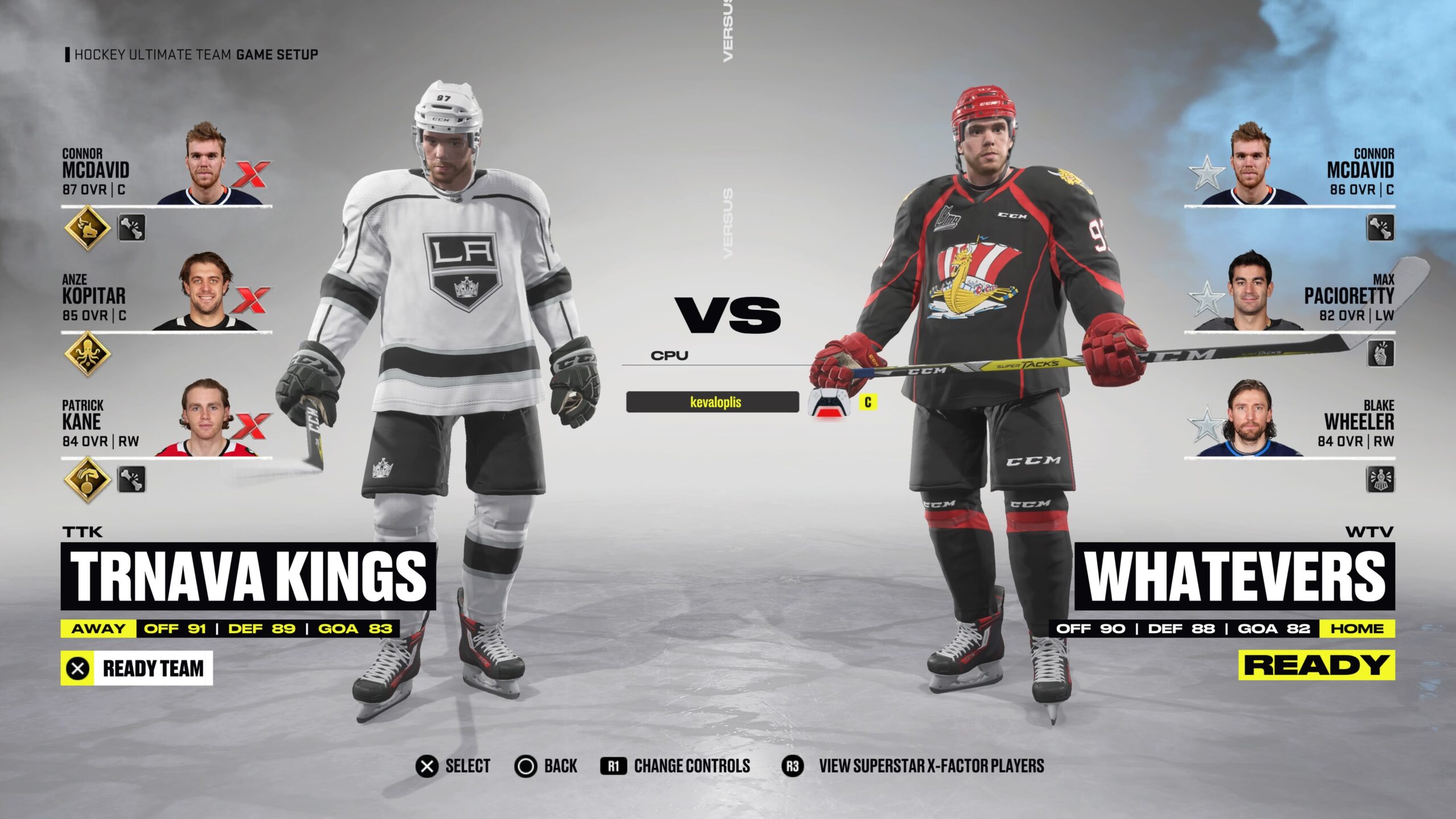
This alternate home jersey for the Baie-Comeau Drakkar out of the QMJHL is no doubt inspired, but it also inspires some important questions. Like, what exactly is a Drakkar? In case the image on the jersey didn’t already give it away, a Drakkar is actually an ancient Viking ship, and that’s been captured in all its glory as part of the logo emblazoned on these uniforms.
The reds of the mast really stand out against the black background, as do the lines that extend out to the sleeves and even onto the stockings. It’s unlikely that hockey sticks were really used back in days of yore to power the ship rather than the more practical option of oars, but they’re a nice touch and succeed in announcing what sport this team will be playing.
SARNIA STING
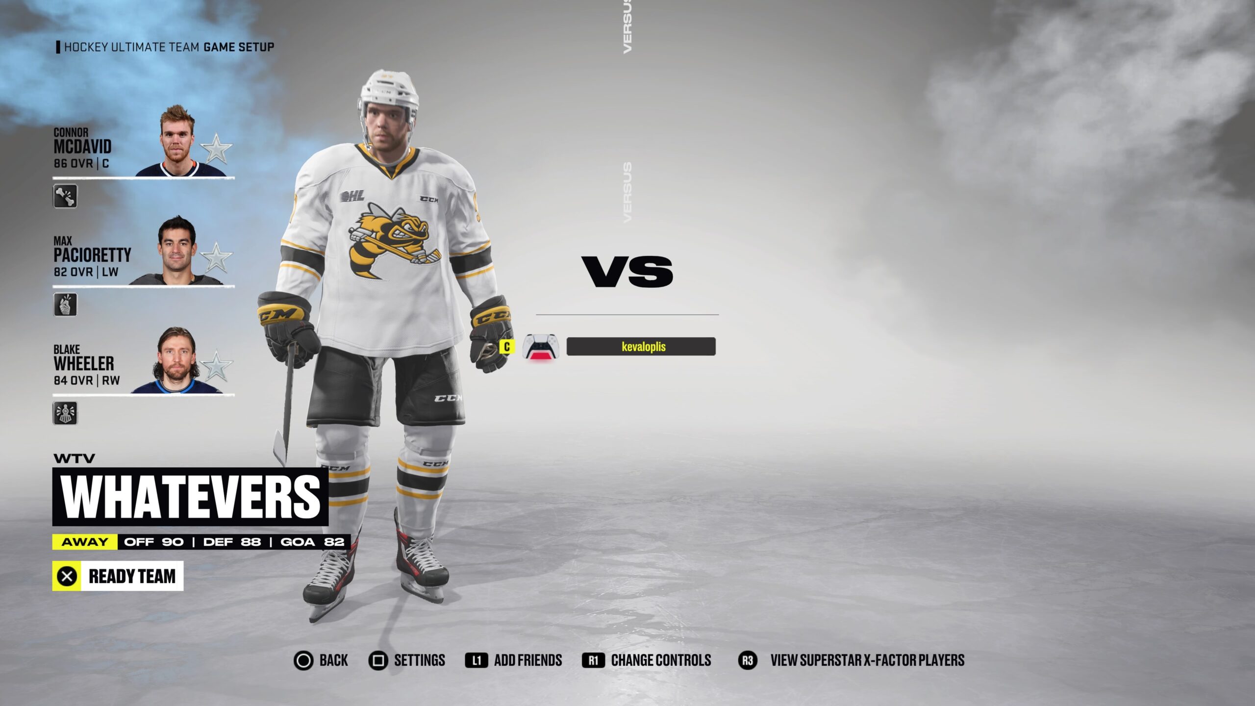
Fans of black and yellow will especially appreciate the way they pop on this light home jersey courtesy of the OHL’s Sarnia Sting. As rare as it it may be to find a North American team that doesn’t end in an “S,” it might be even more rare to find a team that features a bee as a mascot. But what a bee this is!
Just look at how ferocious it looks on the jersey and it’s fairly apparent that this bee means business. It’s also holding a hockey stick and looks as if it knows how to use it considering how it’s sporting adorable little hockey gloves as well. Even the details on the sleeves and the stockings possess some flair, with dark black lines surrounded by thinner yellow ones proving to be the prevailing aesthetic.
HC VITA HASTEN
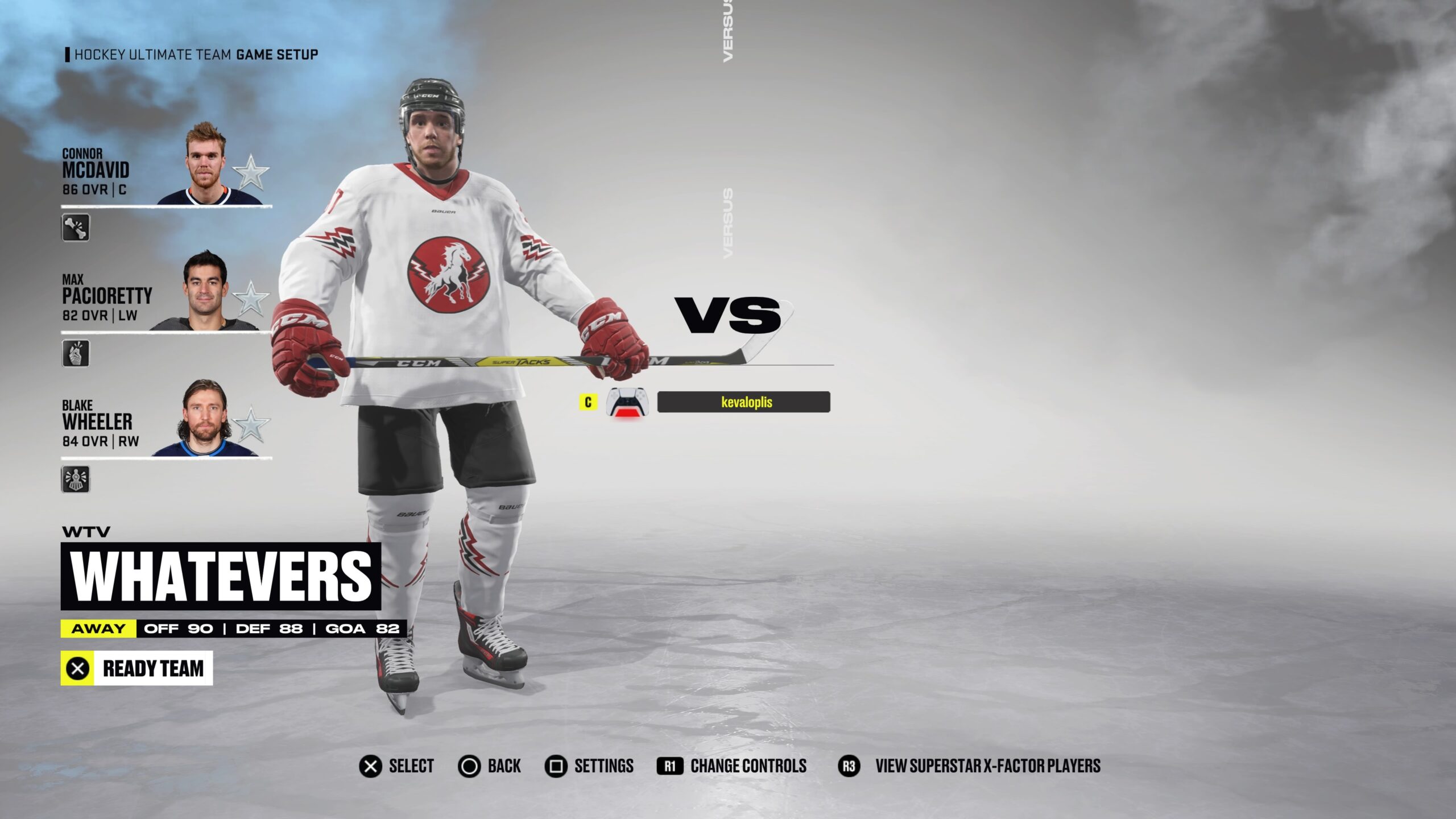
While it may not be all that uncommon for a sports team to have a horse as part of the logo, you’ll be hard-pressed to find one that utilizes a horse as powerfully as this one from HC Vita Hasten of the Swedish HockeyAllsvenskan league. The stallion itself is naturally majestic in stark black and white, but it’s the bright red circle that it lies within and the carefully placed lightning bolts surrounding it that aid greatly to the effect.
The triple red and black bolts on the sleeves and the stockings make the light away jerseys come to life in a way that is sure to make any opponent you face off against stand up and say, “I may have just beaten you 8-0 in a HUT Champions game, but man, those are some tight unis.”
EHC RED BULL MUNCHEN
Believe it or not, there are two different hockey teams sponsored by Red Bull in international leagues, but this alternate jersey from EHC Red Bull Munchen of the Deutsche Eishockey Liga is the one that’s most likely to get you jacked up on that energy high. Of course, the big draw here is the classic logo of two red bulls fighting over a sun that’s become synonymous with the brand.
That should immediately send a message to challengers that not only did this guy come ready to play, but he’s also likely completely wired and has possibly been up for days. These dark blue uniforms also have a subtle checkerboard pattern in a lighter blue across the midsection, sleeves, and stockings that add some welcome flavor to the mix.
HC OLOMOUC And ISERLOHN ROOSTERS


This an unlikely showdown of sorts between the uniforms of two teams who have made the decision, for better or worse, to have their logo be a rooster. On one hand, we have HC Olomouc with its solid bright red jersey that puts the rooster (or chicken?) front and center holding a hockey stick.
On the other hand, we have the Iserlohn Roosters and their white away jerseys that also feature a rooster holding a hockey stick in the middle of some red and blue stripes.
When it comes right down to it, the only choice is to go with the rooster logo that will look the most intimidating to opponents, and that clearly has to be the bigger one one representing the Iserlohn Roosters. The advertisements plastered throughout the rest of the uniform are a little garish, but that impressive rooster helps to make up for the blatant commercialism on display.
PORIN ASSAT
Card sharks will surely appreciate the clean and simple look of this light away jersey of the Porin Assat team that plays in the Finnish elite league, Liiga. Their logo of a spade has been placed smack dab in the center of the uniform and then encircled to have it jump out at you even more. There’s absolutely nothing else surrounding that spade either to clutter up the empty white backdrop, allowing for a less-is-more aesthetic that will suit (pun intended) those who prefer a minimalist approach.
The orange and black stripes on the sleeves, waist, and stockings also add some elegance to the ensemble. The entire look leaves you with the overriding impression that adding anything else to the mix would likely be overkill.
TAMPEREEN ILVES
I just — what even is this thing? Is it a lion or…? You know what? It doesn’t even matter. No matter what it is, it’s clear that it’s amazing. From the flowing mane to the sharp teeth to how its expression seems to read as equal parts goofy and ferocious, the logo for the Tampereen Ilves hockey team — also from Liiga — is powerful enough that it doesn’t need anything else getting in the way of its greatness.
This home jersey has a lot of color to play against its black backdrop too, with green and yellow accents on the sleeves, shoulders, waist, and stockings alongside a pair of bright green pants that really help to tie the whole look together.
TUCSON ROADRUNNERS
This alternate jersey for the Tucson Roadrunners, the AHL minor league affiliate for the NHL’s Phoenix Coyotes, is so striking that it’s almost more like a piece of fine art than it is a jersey. A huge part of that comes down to the conception of the roadrunner logo here, with its jagged lines and varied color scheme that would make it a fine addition to any color-by-numbers book.
The potent mix of crimson, purple, green, and orange somehow blends together much better than you would think it would. The other features of the uniform add even more to the overall effect, with a neat crimson and purple design accenting the sleeves, waist, and stockings to add a somewhat regal feel to the whole outfit.
WILKES-BARRE/SCRANTON PENGUINS
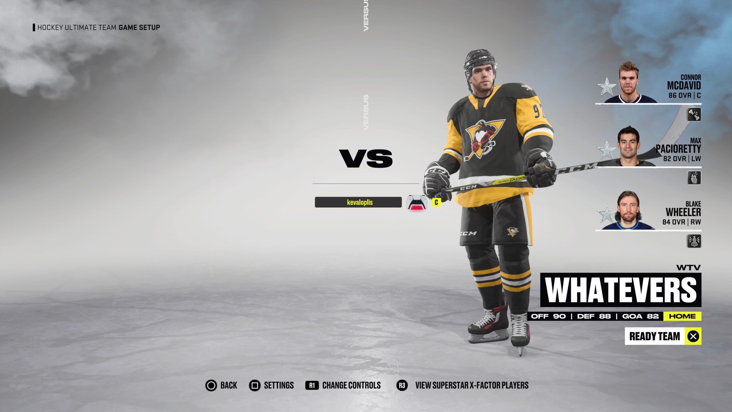
You can go ahead and forget all about the Pittsburgh Penguins because the penguin on their logo has absolutely nothing on the one adorning the jerseys of their AFL affiliate in Wilkes-Barre/Scranton. This beefy bird looks as if it has either been lifting some weights regularly or else taking some sort of supplements, whether legal or illegal, to have it looking this jacked.
This dark home jersey showcases the Penguins’ classic black and yellow color scheme throughout while keeping the focus on the absolute unit situated smack dab in the center of the jersey. It’s a nice touch to have the puffy penguin also sporting bright red gloves to add a splash of another color to the mix.


Published: Nov 30, 2021 05:13 pm